


In today’s fast world, time is money. The better your time is utilized, the more fruitful the results. In this scenario, the last thing you want is to get lost in places and buildings.
Irrespective of how big the offices are, if visitors or even employees feel confused because they are unable to navigate the place, that place cannot be their favorite. Here’s when wayfinding signs come to the party. They not only solve this problem but are also eye-pleasing. And most importantly, they work plain and simple.
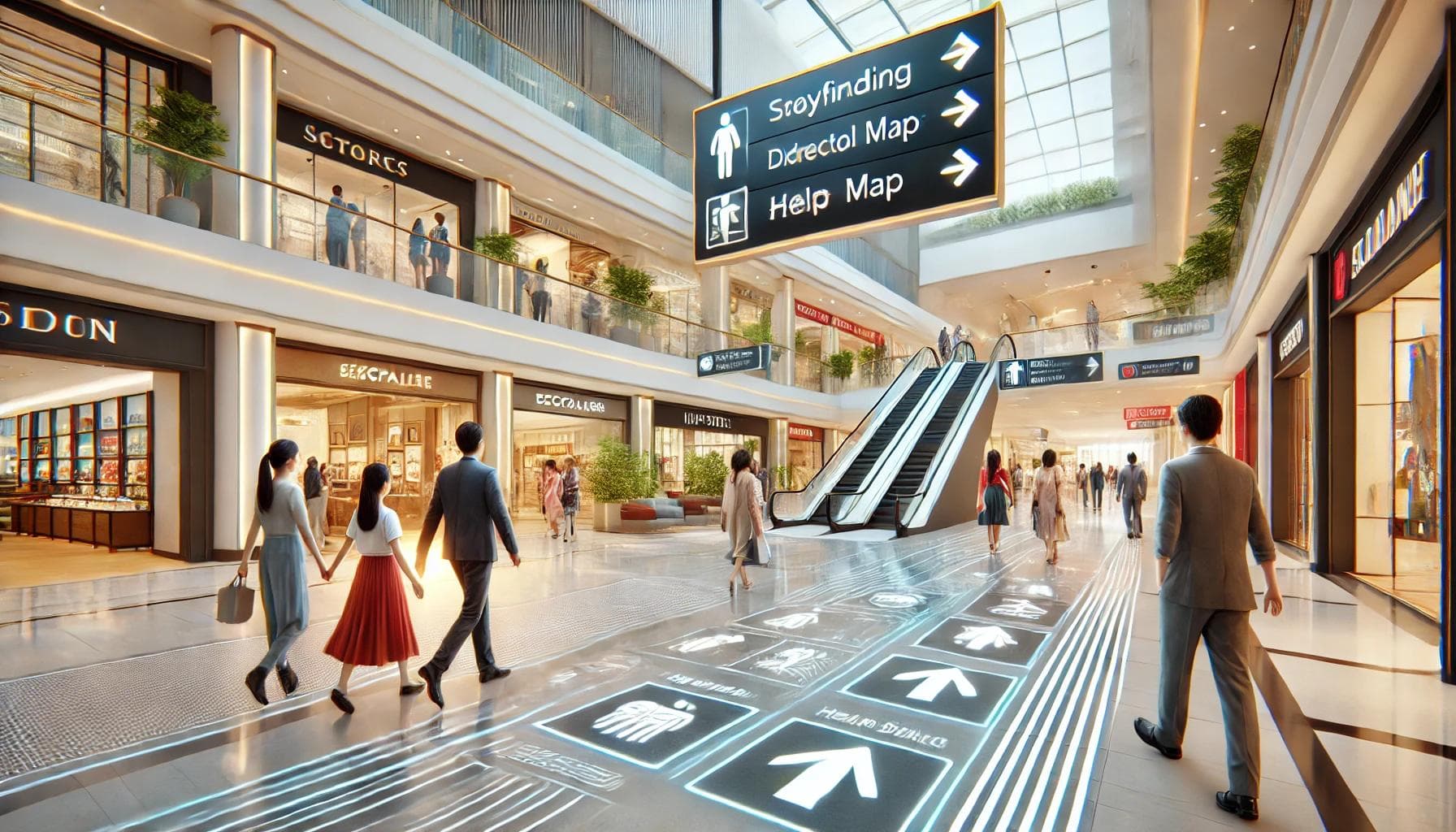
Why Wayfinding Signs Work?
The wayfinding signs work because they solve a basic human problem, the problem of ambiguity. Wayfinding signs are not just pieces hanging around the place; they effectively guide, inform, and enhance customer experience.
Through wayfinding signs, brands can smoothly transform their customer's experience. The inability to find their way and be in their desired place greatly frustrates visitors in the office. One study shows that around 80% of visitors feel annoyed due to poor navigation, and it isn’t just confined to visitors—employees also feel the same.
This study also points out that poor navigation impacts employee productivity. The solution is wayfinding signs; they convert these pain points into comfort by giving clear and concise guidance throughout the place.
How the Wayfinding Signs Work?
Here’s how they work:
- Make yourself mentally relaxed: Through wayfinding signs, you are just walking around, thinking, and doing your business without focusing on figuring out your way. Wayfinding signs are there for you to float around the place.
- They save time: Wayfinding signs efficiently save time by eliminating your task of knowing about things on your own.
- They build confidence: Humans feel confident in a familiar environment that they know and can help themselves independently. That’s why we live comfortably and confidently in our homes.
How Wayfinding Signs Enhance Customer Experience in Offices?
1. First Impression is Last Impression
The first minute of the customer in your office is what he/she’ll take back with them. The perception of your office is mainly shaped at its entrance and reception, so the signs here must be concise, guiding, aesthetically pleasing, and eye-catching. It must make the customer realize that the office is well-organized and serious in their work.
2. By Reducing Stress and Saving Time
Lost customers are customers lost. In the era of wayfinding signs, there’s no longer a need to be in awkward situations by asking for directions. They not only save you from getting lost but also save 40% of time in reaching the desired place and make customer interaction calm and focused.
3. By Making Inclusive Signs
Offices with inclusive signs witness a 30% rise in positive response. Introducing inclusive design isn’t just about good marketing but also ethically correct. Signs can be inclusive by adding multilingual texts and symbols.
The purpose behind this idea is that people with disabilities, language barriers, and other issues should not face any inconvenience. Overall, inclusive wayfinding signs are not just a matter of choice but essential.
4. By Enhancing Safety and Trust
Safety signs like exit signs in emergencies and evacuation routes create a sense of security in customers. One study shows that emergency exit signs make 92% of customers feel safe. This builds customers’ trust in the company and eventually makes them valuable customers.
5. By Encouraging Exploration and Engagement
Strategic signage can guide visitors to other areas in the office like cafés, lounges, or other spaces they might otherwise miss. This not only improves their experience but also creates opportunities for informal interactions.
6. By Building Brand Loyalty
A smooth, stress-free visit leaves a lasting impression. Customers who feel valued are 25% more likely to return and recommend you to their friends and family. Once trust is gained by the company, then the customer won’t take much time to have any business interaction with you.
How to Design Wayfinding Signs That Enhance Customer Experience?
Designing effective wayfinding signs is not just about putting up arrows. It’s about creating a system that guides people smoothly, reduces stress, and leaves a positive impression. Here’s how you can do it step by step:
1. Customer-Oriented Design
The first step is to think like a customer and understand the needs of the people who will use the signs. This includes visitors, clients, delivery personnel, and even new employees.
Walk through your office as if you’re a first-time visitor. Identify key areas where people might get confused, such as entrances. For example, if visitors often struggle to find the reception desk, place a clear, visible sign at the entrance.
You can test your wayfinding signs by asking someone new to navigate your office using the signs and observing where they face difficulties. When signs are designed with the user in mind, the best results come.
2. Consistency
Consistency is key to making wayfinding signs effective. If every sign looks different, it can confuse people instead of helping them.
- Consistency can be achieved by using the same font and the same color.
- The use of a single color, ideally the theme color of your brand, can leave a lasting impact on customers.
- The usage of different symbols for one thing at different places can also confuse visitors.
- Wayfinding signs also make the system predictable for customers, which is a great feeling for them.
3. Clarity
Wayfinding signs should be easy to read and understand at a glance. This can be done by using short and direct text. Instead of writing “on the left or right,” an “arrow” can be used, along with other universal symbols for different purposes. The idea is to have minimal text and symbols that can be understood at a glance.
4. Visibility
If signs are hard to spot, they won’t serve their purpose. Ensure signs are positioned where people naturally look, not too high or too low.
- The selection of colors and the background color of signs is vital.
- The usual design, which has white text on a black background, works perfectly.
- Signs should be well-lit, and neon colors and lights can be used for visibility.
- The idea is that wayfinding signs should not be missed by people, even if they are in a hurry.
5. Digital Signs
Modern offices can enhance wayfinding by equipping conventional signs with technology. Conventional signs are difficult and costly to update, whereas digital signs can be regularly updated according to needs and time of the year.
6. Feedback and Improvement
Wayfinding systems should be continuously updated based on feedback and changing needs. This can be achieved by surveying visitors and employees about their experience with the signs. Observe visitors' interaction with the signs and identify areas for improvement.
Why Choose Branditt for Your Wayfinding Signs?
Confusing layouts, lost visitors, and frustrated employees—poor navigation can harm customer experience and productivity. When people struggle to find their way, they waste time, feel unwelcome, and may even take their business elsewhere.
At Branditt, we eliminate these frustrations with expertly designed wayfinding signs that guide visitors seamlessly. As a top-rated signage company in Toronto, we specialize in clear, aesthetically pleasing, and strategically placed signs that enhance navigation and reinforce your brand identity.
With Branditt, you get:
✅ Custom-designed wayfinding solutions tailored to your space and brand.
✅ Highly visible and easy-to-read signs that reduce confusion.
✅ Durable materials and sleek designs for a professional look.
✅ Expert guidance from consultation to installation.
Make navigation effortless and leave a lasting impression on every visitor. Partner with Branditt today and transform your space with signage that works!
📞 Call us now or visit our website to get started!